This is the first of many posts containing the content of my online Principles of Statistical Inference course, taught entirely using R. These are very basic posts aimed at beginning R users; the course is for master’s-level public health students. A possible long-term goal is to stitch all of these posts into a standalone book. At the very least, this will serve as an archive of everything I have prepared.
Here I am just reading in some data using read.csv() and using it to make a few simple scatterplots using ggplot.
The heart.csv file may be downloaded here.
#First we read in some data
heart <- read.csv("C:/epi551/old/heart.csv", header=T)

#We call a package for making plots
library(ggplot2)

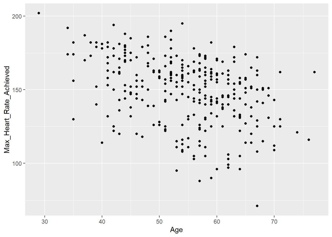
#We make a sample plot of the data we read in
ggplot(data=heart) +
  geom_point(mapping=(aes(x=Age, y=Max_Heart_Rate_Achieved)))
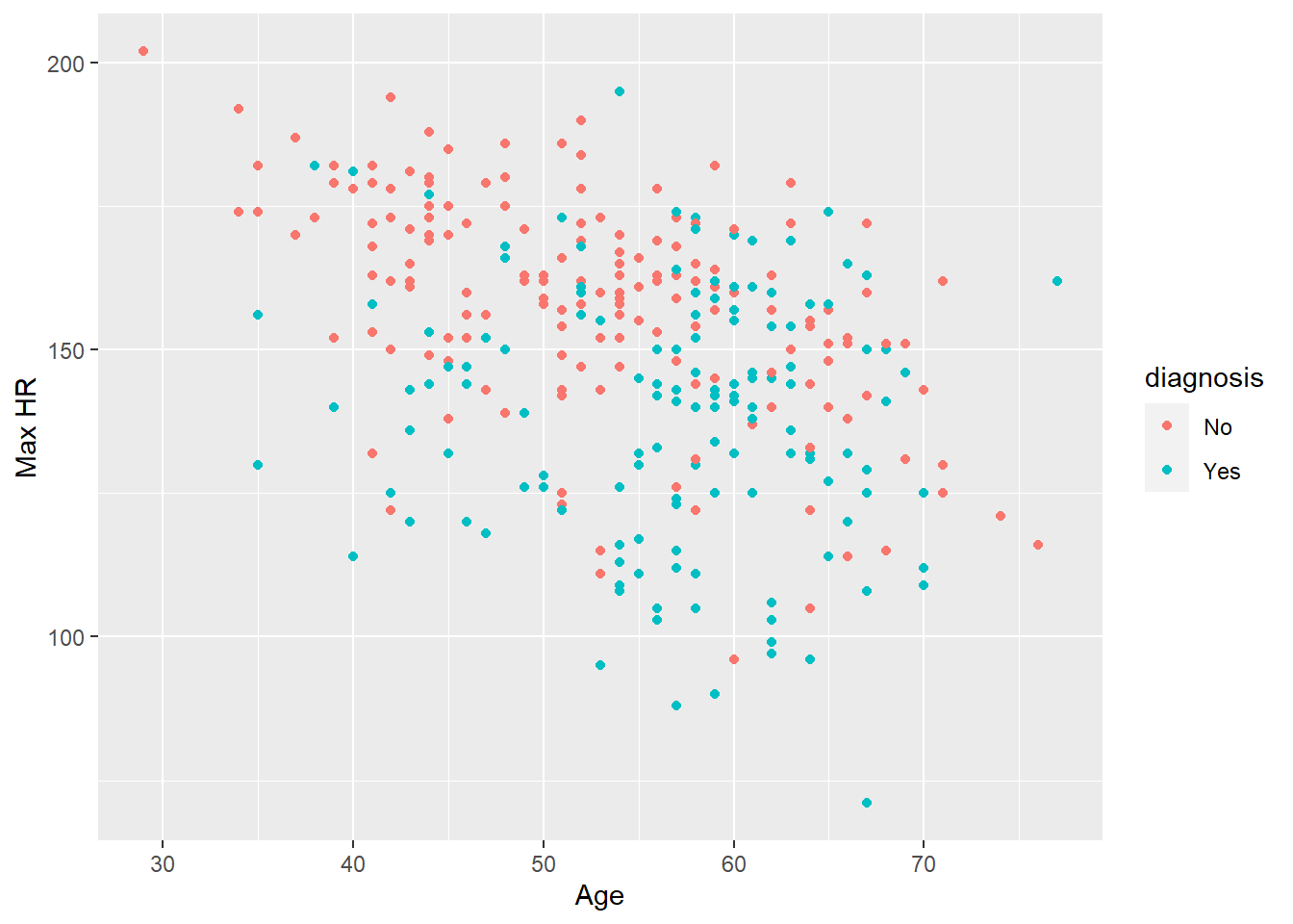
#We make a more enhanced version of the plot
ggplot(data=heart) +
  geom_point(mapping=(aes(x=Age, y=Max_Heart_Rate_Achieved, color=diagnosis))) +
  ylab("Max HR")