Bar charts using factors
There are times when you want to graph something that is coded with numbers, but the numbers really represent categories. An example is in the thalassemia variable we have seen previously, where 3=Normal, 6=Fixed Defect, and 7=Reversable Defect.
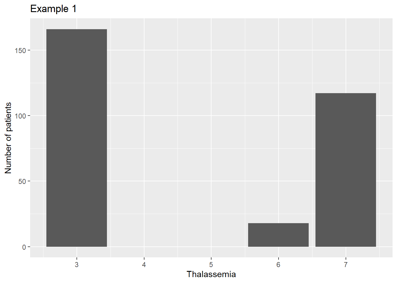
If we convert the variable to an integer to get rid of the missing values, the plot is irregularly spaced, as if 3 and 6 and 7 were actual measurements.
library(ggplot2)
library(dplyr)

heart <- read.csv("C:/epi551/heart.csv", header=T)

heart$thal <- as.integer(heart$Thalassemia)

ggplot(data=heart, aes(x=thal)) +
  geom_bar() +
  scale_fill_manual(guide=F) +
  xlab("Thalassemia") +
  ylab("Number of patients") +
  ggtitle("Example 1")
Instead we can convert the values into a different data type called a factor. The textbook covers this in some detail.
heart$thal2 <- factor(heart$Thalassemia)

ggplot(data=heart, aes(x=thal2)) +
  geom_bar() +
  scale_fill_manual(guide=F) +
  xlab("Thalassemia") +
  ylab("Number of patients") +
  ggtitle("Example 2")
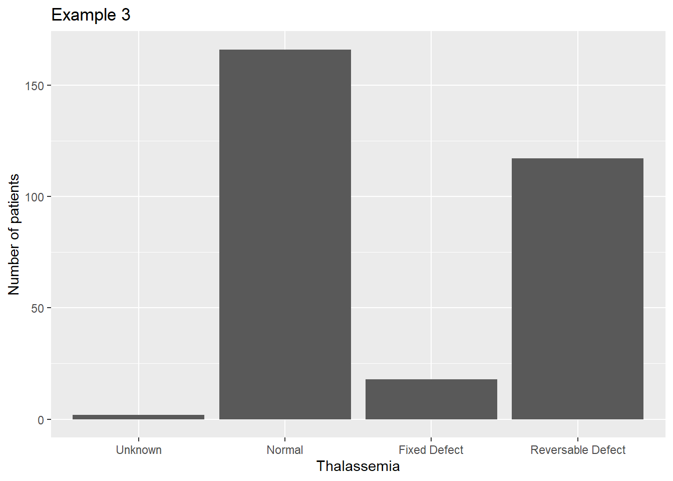
Now the graph is spaced correctly, but the labels are not informative to the reader. We can assign labels to the factor by adding another parameter to the factor() function:
heart$thal3 <- factor(heart$Thalassemia, labels=c('Unknown','Normal',
  'Fixed Defect','Reversable Defect'))

ggplot(data=heart, aes(x=thal3)) +
  geom_bar() +
  scale_fill_manual(guide=F) +
  xlab("Thalassemia") +
  ylab("Number of patients") +
  ggtitle("Example 3")
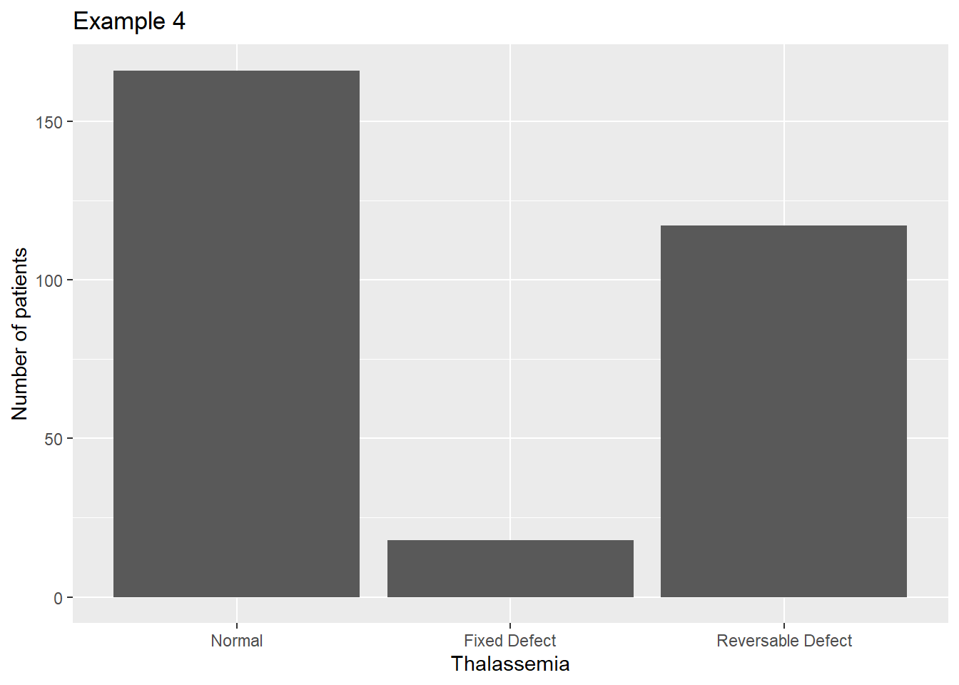
If we want to get rid of that tiny unknown category, we can drop those values as we did in a previous lecture:
heart <- filter(heart,Thalassemia !="?")

heart$thal4 <- factor(heart$Thalassemia, labels=c('Normal',
  'Fixed Defect','Reversable Defect'))

ggplot(data=heart, aes(x=thal4)) +
  geom_bar() +
  scale_fill_manual(guide=F) +
  xlab("Thalassemia") +
  ylab("Number of patients") +
  ggtitle("Example 4")