Skew and kurtosis
These descriptive statistics are a bit less common than the others we are seeing this week, but they are useful nonetheless. Most inferential statistics, as we will learn, assume that the data are approximately normally distributed, meaning they follow a bell-shaped curve. When data are not normally distributed, you can end up with some unexpected results. Skew and kurtosis are two measures of non-normality.
Skew describes how data are unbalanced either to the left or the right on a graph. The skew() function is in the semTools package.
library(semTools)
no_skew <- rep(c(1,2,3,4,5,6,7,8,9,10,11),10)
mean(no_skew)
## [1] 6median(no_skew)## [1] 6skew(no_skew)## skew (g1) se z p
## 0.0000000 0.2335497 0.0000000 1.0000000Here the data are perfectly balanced - the mean and median are equal, both 6. The skew is 0 (don’t worry about the other statistics for now).
Next we have data with a lot of low values and a few high values:
positive_skew <- rep(c(1,1,1,1,1,1,7,8,9,10,26),10)
mean(positive_skew)
## [1] 6median(positive_skew)## [1] 1skew(positive_skew)## skew (g1) se z p
## 1.769406e+00 2.335497e-01 7.576144e+00 3.552714e-14The mean is still the same (6), but now the median is smaller and the skew is positive.
Finally we have data with a lot of high values and a few low values:
negative_skew <- rep(c(0,0,2,6,7,7,8,8,9,9,10),10)
mean(negative_skew)
## [1] 6median(negative_skew)## [1] 7skew(negative_skew)## skew (g1) se z p
## -0.7982221641 0.2335496832 -3.4177831158 0.0006313339The mean is once again 6, but now the median is higher and the skew is negative.
Note that since skew in example 2 was 1.77 and skew in example 3 was -0.80, we can say that example 2 is more skewed than example 3.
How much skew is too much before we need to worry? We are still a few weeks away from answering that question.
library(ggplot2)
skewplot <- data.frame(no_skew, positive_skew, negative_skew)
ggplot(data=skewplot, aes(x=no_skew)) +
geom_histogram() 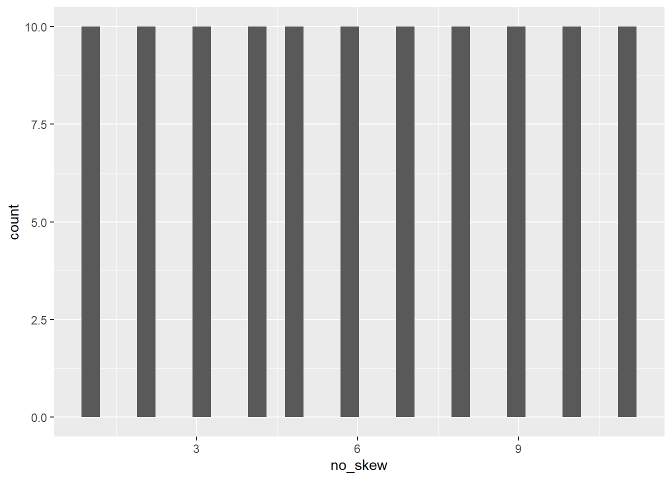
ggplot(data=skewplot, aes(x=positive_skew)) +
geom_histogram() 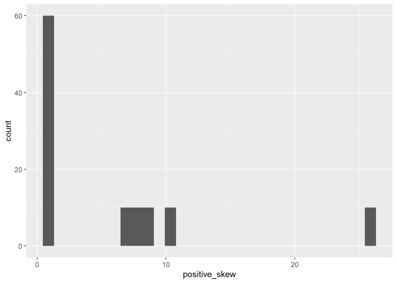
ggplot(data=skewplot, aes(x=negative_skew)) +
geom_histogram() 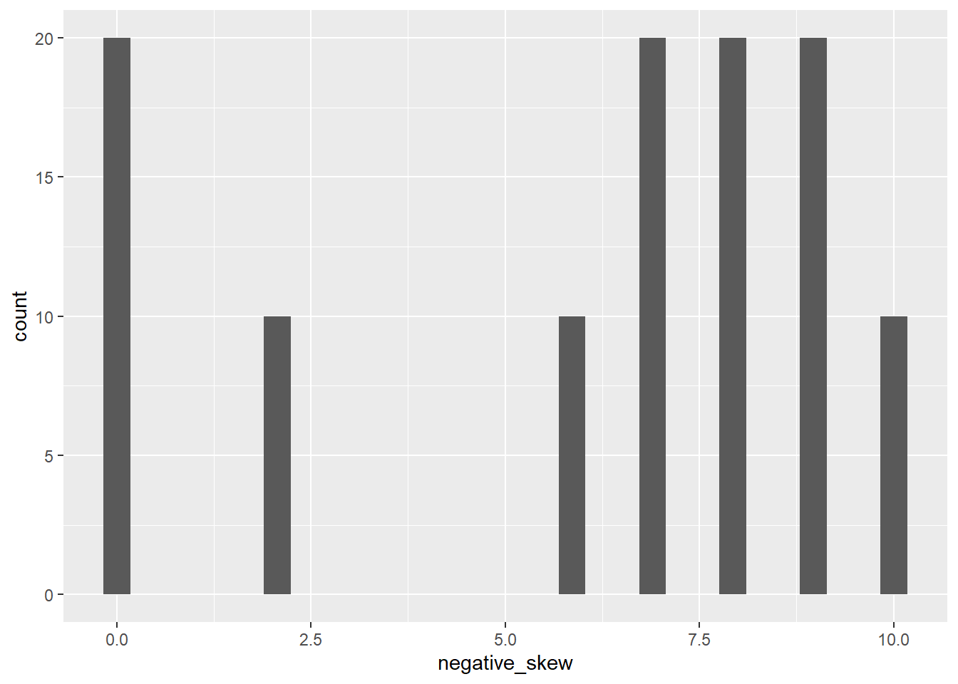
If skewness measures whether the distribution is shifted left or right, kurtosis can be thought of whether it is shifted up or down. Or, in other words, is the bell-shaped curve pointy or flat? Are most of the values close to the mean or are they far away? The kurtosis() function is also in semTools.
Here I generate random data from a normal distribution, which has kurtosis close to zero. To get negative kurtosis, I add a bunch of data at the extremes of the distribution. To get positive kurtosis, I add a bunch of data at the middle.
set.seed(106)

normal_kurtosis <- rnorm(300)
kurtosis(normal_kurtosis)
## Excess Kur (g2) se z p
## 0.07108591 0.28284271 0.25132663 0.80156159negative_kurtosis <- c(rnorm(100),rnorm(100)+3,rnorm(100)-3)
kurtosis(negative_kurtosis)## Excess Kur (g2) se z p
## -1.0943527090 0.2828427125 -3.8691211078 0.0001092284positive_kurtosis <- c(rnorm(100),rnorm(200)/10)
kurtosis(positive_kurtosis)## Excess Kur (g2) se z p
## 5.3316277 0.2828427 18.8501506 0.0000000kurtplot <- data.frame(normal_kurtosis,negative_kurtosis,positive_kurtosis)
ggplot(data=kurtplot, aes(x=normal_kurtosis)) +
geom_histogram() 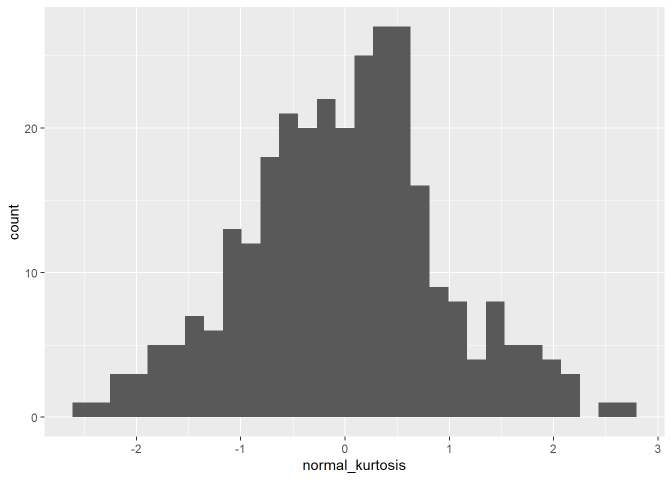
ggplot(data=kurtplot, aes(x=negative_kurtosis)) +
geom_histogram() 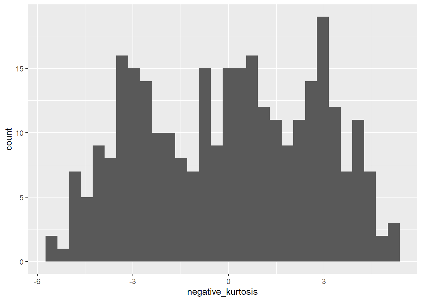
ggplot(data=kurtplot, aes(x=positive_kurtosis)) +
geom_histogram() 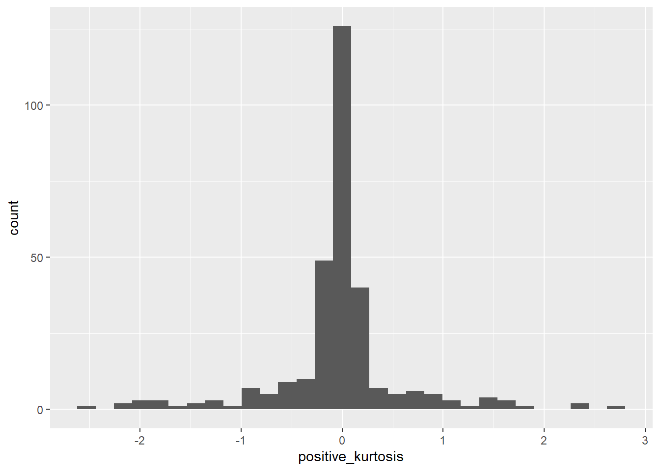
The first plot looks like a bell-shaped curve, roughly. The second is flattened, the third is pointy.