Histograms
Histograms are a type of bar chart where the x-axis consists of continuous data divided into evenly-spaced bins and the y-axis are counts. In this example we have a file of 1,000 birth weights from an old study.
library(ggplot2)
library(dplyr)

bw <- read.csv("C:/epi551/old/BIRTHWEIGHT.csv", header=TRUE)

#we see there are only 2 fields - id number and birthweight in ounces
summary(bw)
## ï..id weight
## Min. : 0.0 Min. : 8.00
## 1st Qu.:249.8 1st Qu.: 97.75
## Median :499.5 Median :112.00
## Mean :499.5 Mean :106.86
## 3rd Qu.:749.2 3rd Qu.:125.00
## Max. :999.0 Max. :198.00#Converting ounces to grams with a new field (could have also used mutate)
bw$grams <- bw$weight * 28.35
#The header of the first field came in strangely - this happens sometimes
#fixing it here
colnames(bw)[1] <- "id"
#And now a ggplot statement to create a histogram
ggplot(data=bw, aes(grams)) +
geom_histogram()
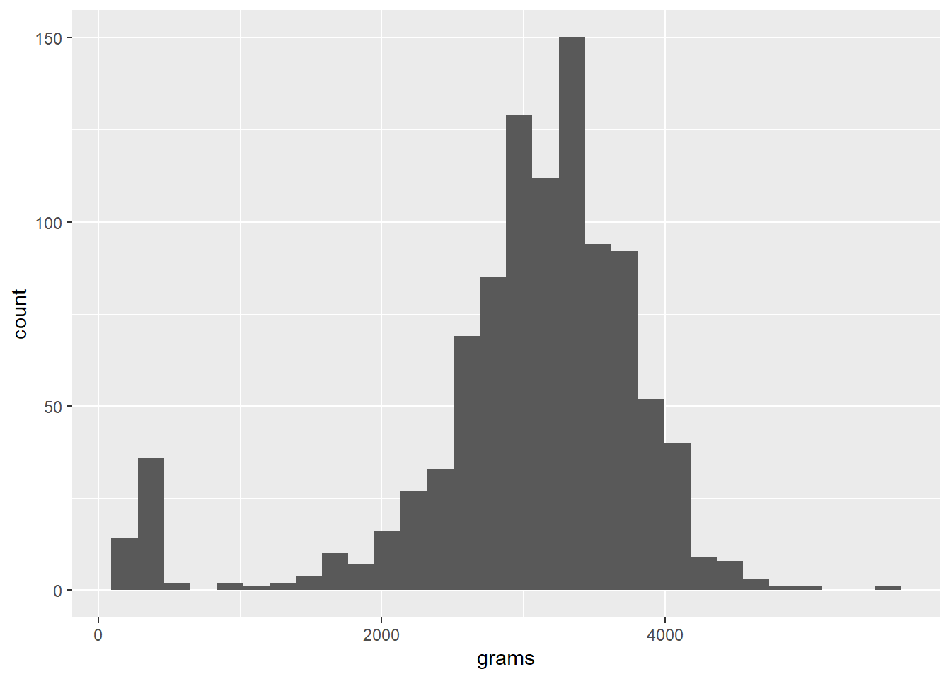
The histogram shows a bell-shaped curve, but with a strange spike at the low end. This deserves some investigation.
low_bw <- filter(bw, grams<750)
head(low_bw,20)
## id weight grams
## 1 17 13 368.55
## 2 37 15 425.25
## 3 57 11 311.85
## 4 77 13 368.55
## 5 97 11 311.85
## 6 117 8 226.80
## 7 137 14 396.90
## 8 157 9 255.15
## 9 177 13 368.55
## 10 197 11 311.85
## 11 217 11 311.85
## 12 237 12 340.20
## 13 257 15 425.25
## 14 277 11 311.85
## 15 297 10 283.50
## 16 317 11 311.85
## 17 337 11 311.85
## 18 357 12 340.20
## 19 377 9 255.15
## 20 397 12 340.20Each of these is a value in the ounces column between 8 and 17. Since a baby this small could not live, these could have been recorded in pounds or perhaps they are in ounces with the pounds missing. You would want to check with the data provider or, if unable to do so (like here), just drop them.
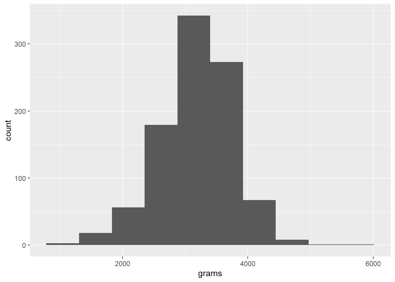
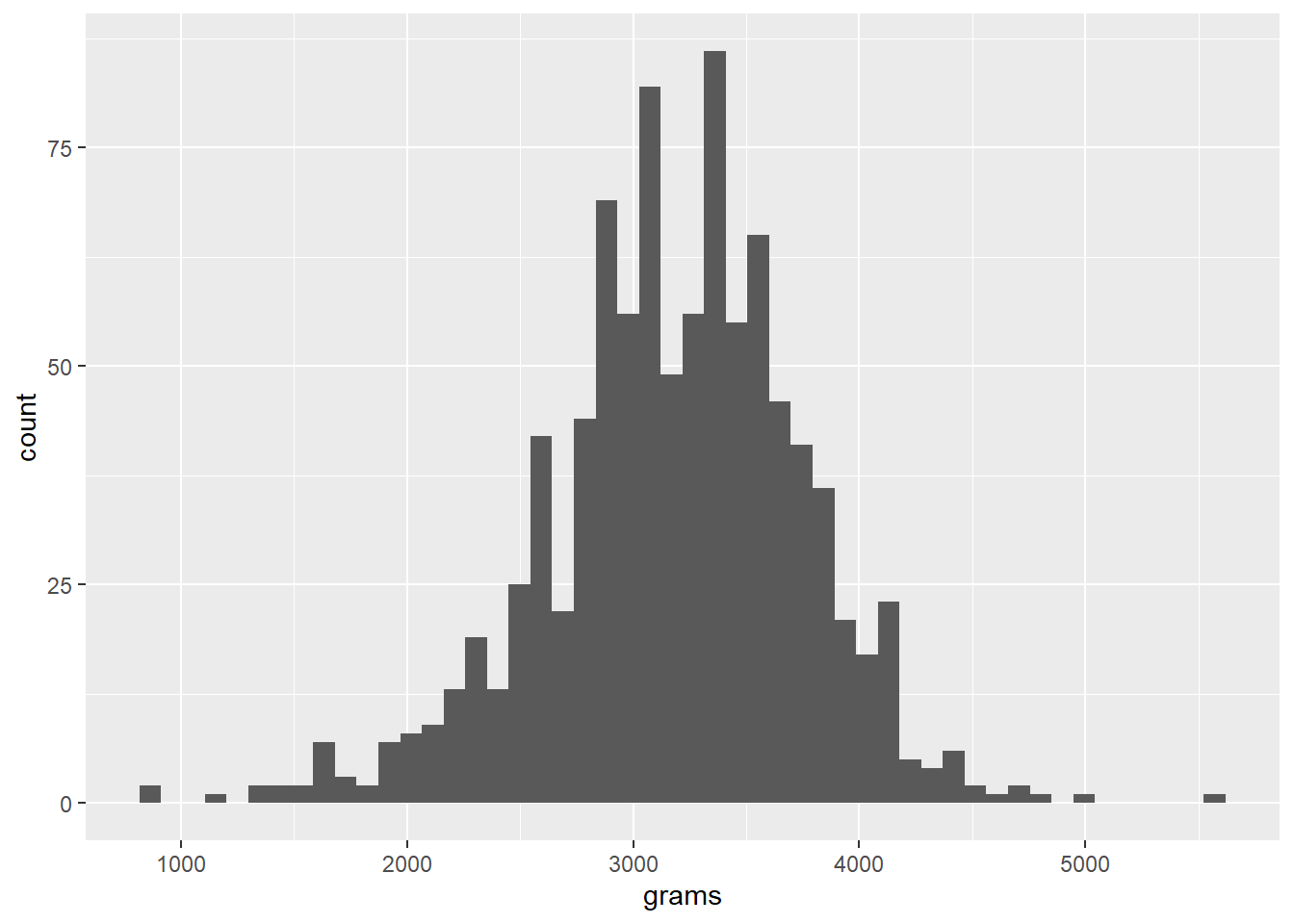
One of the useful parameters for a histogram is the number of bins. The default is 30, but you can choose more or fewer, as seen here:
bw <- filter(bw, grams>750)
ggplot(data=bw, aes(grams)) +
  geom_histogram(bins=10)
ggplot(data=bw, aes(grams)) +
  geom_histogram(bins=50)