Box plots and stem-and-leaf plots
Box plots
A box plot is one of the most efficient graphical summaries ever devised. With just a few lines and symbols, you can show the minimum (excluding outliers), maximum (excluding outliers), median, first quartile, third quartile, and specific values of outliers.
We will use an example with made-up data:
library(ggplot2)

somedata <- data.frame(c(1:50,32,43,44,21,23,23,23,105,75))
colnames(somedata)[1] <- "vals"

ggplot(data=somedata, aes(y=vals))+
  geom_boxplot()
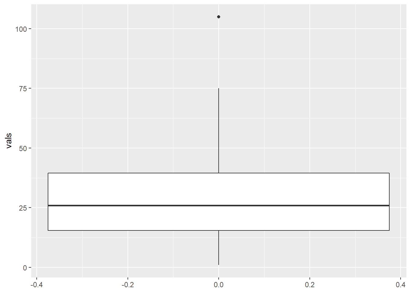
105 is considered an outlier, showed with an black dot. As for the other quantities, the minimum is 1 (bottom of vertical line), maximum 75 (top of vertical line), median 26 (thick horizontal line), first quartile 15.5 (bottom of box), third quartile 39.5 (top of box).
Let’s add a few touches to make it look more presentable:
library(ggthemes)

ggplot(data=somedata, aes(y=vals)) +
  geom_boxplot(fill = "goldenrod", colour = "darkblue") + #1
  ylab("Value") + #2
  ggtitle("Box plot example") + #3
  theme_economist() + #4
  theme(axis.text.x=element_blank()) + #5
  theme(axis.ticks.x=element_blank()) #6
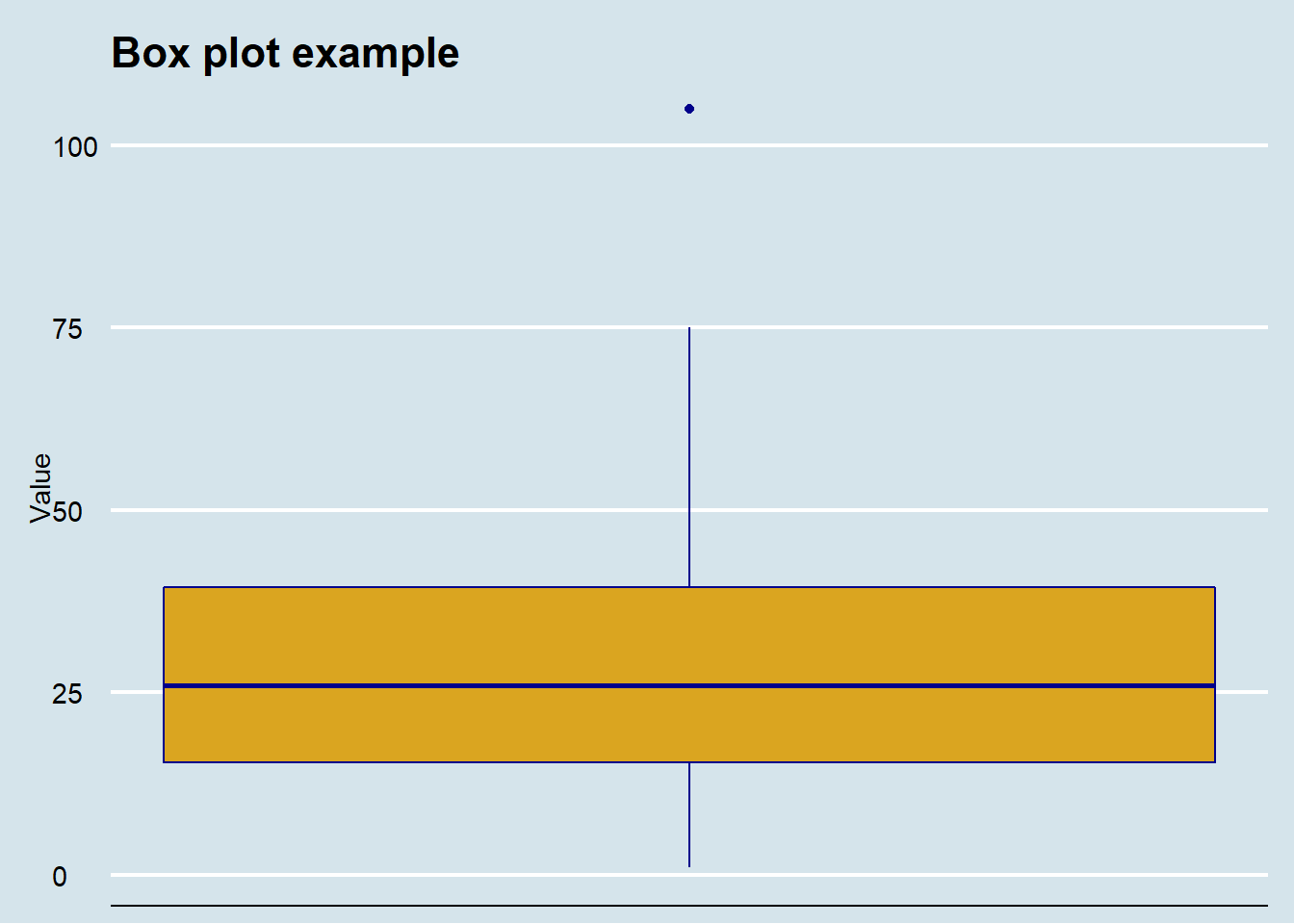
Here is what I did:
1. Added some color
2. Changed the y-axis label
3. Added a title
4. Used theme() to make it look like a graphic that would be published in the Economist. These required the package ggthemes. There are a large number of choices for themes in this package.
5-6. Got rid of the labels and tick marks on the x-axis because they are meaningless.
How do I know all of these things, aside from having done it for a number of years? I don’t remember all of them, but Googling what you want to do works nearly all the time. For example, for steps 5 and 6 I could not remember the exact syntax so I Googled “remove axis text ggplot r” and every first-page result gave me the answer.
Stem-and-leaf plots
The stem-and-leaf plot comes from the built-in stem() function:
somedata <- c(1:50,32,43,44,21,23,23,23)
stem(somedata)
##
## The decimal point is 1 digit(s) to the right of the |
##
## 0 | 1234
## 0 | 56789
## 1 | 01234
## 1 | 56789
## 2 | 011233334
## 2 | 56789
## 3 | 012234
## 3 | 56789
## 4 | 0123344
## 4 | 56789
## 5 | 0It’s kind of like a histogram with the data itself forming the bars. The “stem” in this case is the first digit, while the “leaves” are the second digit. If you have more complex data, R chooses a stem that is most reasonable.