Stacked and grouped bar charts
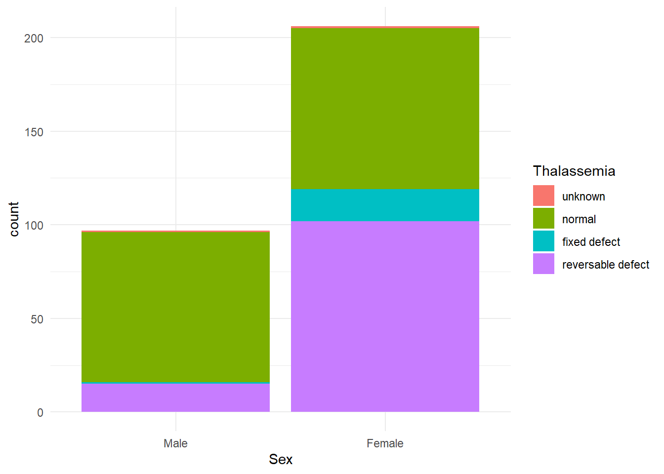
Here are a few ways to make bar charts more informative. First, stacked bar charts can be made with the fill= parameter.
We’re using the heart data and I am first converting Sex and Thalassemia to labeled factors so we don’t see the numeric values.
library(ggplot2)
heart <- read.csv("C:/epi551/heart.csv",header=T)

heart$Sex <- factor(heart$Sex,labels=c("Male","Female"))
heart$Thalassemia <- factor(heart$Thalassemia, labels=c("unknown","normal","fixed defect","reversable defect"))

ggplot(heart, aes(x=Sex, fill=Thalassemia)) +
  geom_bar() +
  theme_minimal()
We saw a theme the other day. theme_minimal() is a popular built-in theme that removes some of the shading.
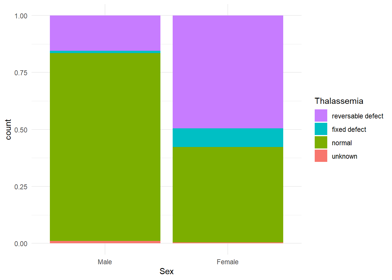
The problem with this graph is that it looks weird to have the unknown values on top. We could remove them, or we could flip the bars and legend. Doing this requires quite a bit of code - a position parameter in geom_bar and a guides() statement.
ggplot(heart, aes(x=Sex, fill=Thalassemia)) +
  geom_bar(position=position_fill(reverse = TRUE)) + #flip bars
  theme_minimal() +
  guides(fill = guide_legend(reverse = TRUE)) #flip legend
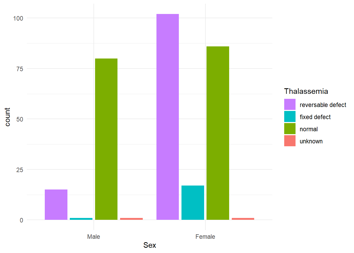
For a grouped bar chart, we change the position parameter. We still want to reverse the order, so we keep that part.
ggplot(heart, aes(x=Sex, fill=Thalassemia)) +
  geom_bar(position=position_dodge2(reverse=TRUE)) + #group and flip
  theme_minimal() +
  guides(fill = guide_legend(reverse = TRUE)) #flip legend