Waffle charts
Data visualization is a vitally important part of statistical inference, one that is sometimes omitted from courses like these, where students are led to believe this is something they are supposed figure out for themselves. On the contrary, in my meeetings with clients I would say I spend well over half my time interpreting graphic presentations of data.
Since I have already covered bar graphs, I will jump straight to a new time of chart known as the waffle chart. It uses a package called waffle. I call the waffle library and load our familiar heart data. As always, we need dplyr as well. In the last line of the code chunk below, I replace the annoying ? values with 9s. NAs would have been better, but I wanted to show an example of how you can replace a value with another value using mutate().
library(waffle)
library(dplyr)
heart <- read.csv("https://archive.ics.uci.edu/ml/machine-learning-databases/heart-disease/processed.cleveland.data",header=F)
colnames(heart)[13] <- "Thalassemia"
heart <- mutate(heart,Thalassemia=replace(Thalassemia, Thalassemia=="?","9"))
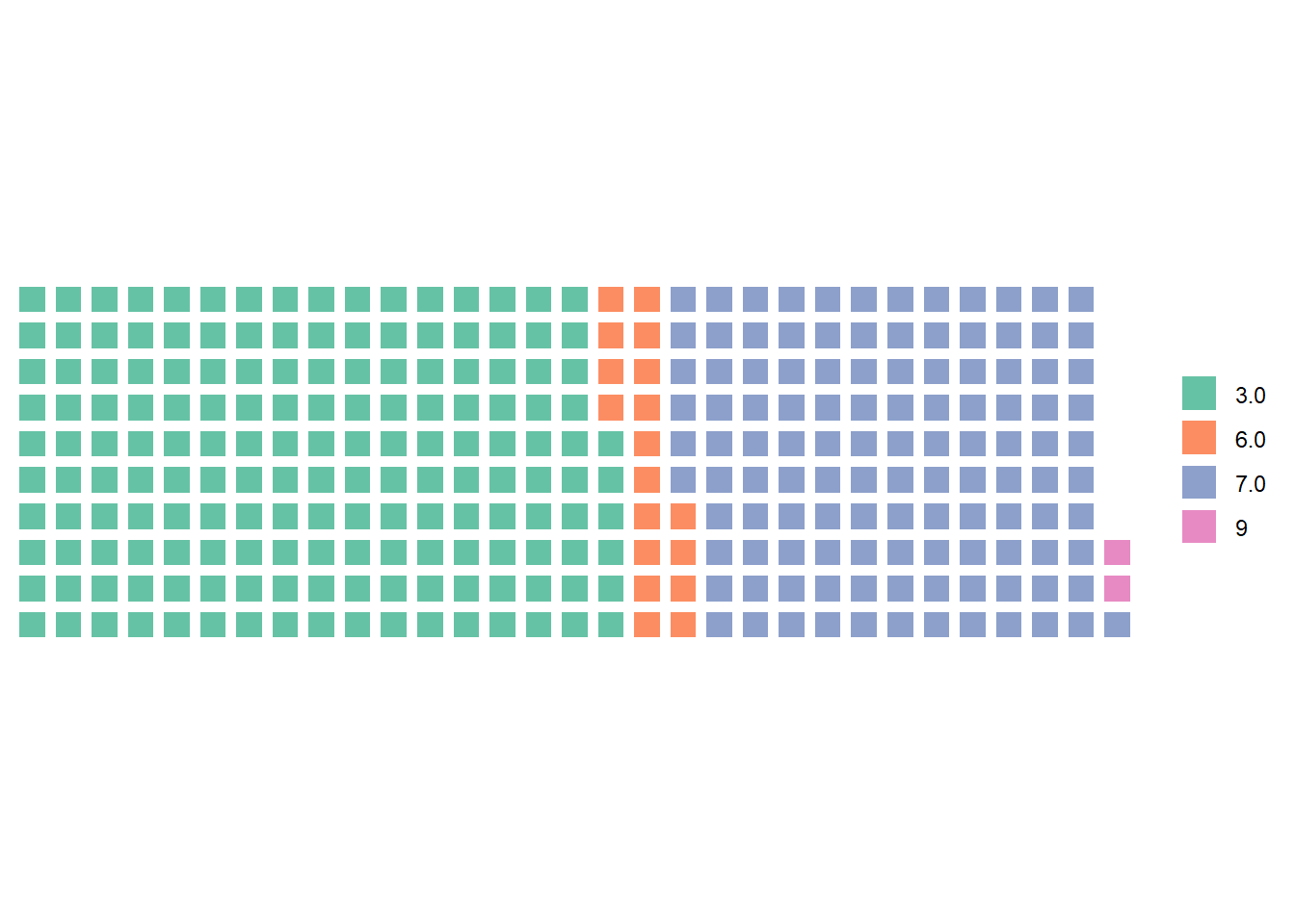
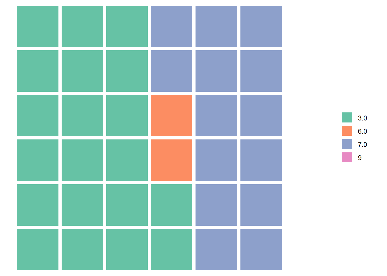
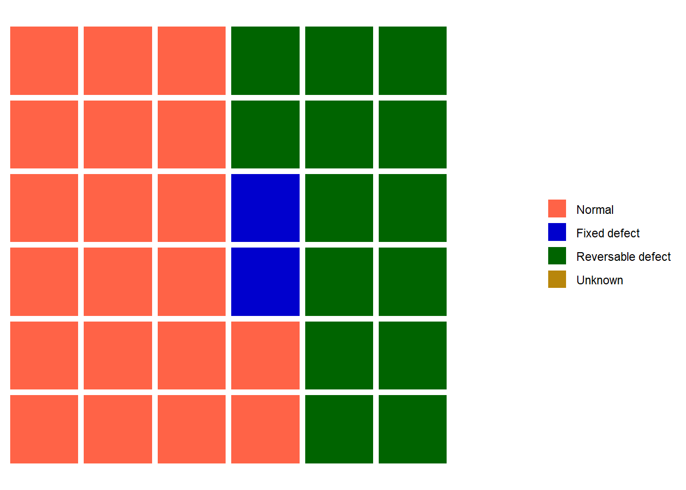
In order to make a waffle plot of the thalassemia variable, we first need to convert it into a table using the table() function. We then use the waffle() function on the table, specifying the number of parts (squares) and rows. The first example plots 303 squares (one for every observation) in 10 rows. The second example plots 36 squares (303 divided by 8, rounded off) in 6 rows. The third example is the same as the second, but with a nicer legend.
thaltable <- table(heart$Thalassemia)

waffle(parts=thaltable, rows=10)
waffle(parts=thaltable/8, rows=6)
heart$thal <- factor(heart$Thalassemia, labels=c("3"="Normal",
        "6"="Fixed defect","7"="Reversable defect", "9"="Unknown"))

thaltable <- table(heart$thal)

waffle(parts=thaltable/8, rows=6,
       colors = c("3"="tomato",
                  "6"="mediumblue",
                  "7"="darkgreen",
                  "9"="darkgoldenrod"),
       reverse=FALSE)
What happened to the unknown category in the last few plots? The number of observations is so small that it only would get a tiny fraction of a square, hence it disappears.
Where do you find the names of the colors in R? Type demo(colors) in the console. You’ll have to hit zoom to see the resulting plot.